Email Address: contact@softwareistic.com | Phone Number: (844) 970-3900
Email Address: contact@softwareistic.com | Phone Number: (844) 970-3900


The age-old saying about the first impression being the last has certainly stood the test of time, and it applies perfectly to many of the solutions that we use today. If you don’t set a good impression with performance, app design, and usability, you’re more than likely to lose a customer. More than being just eye candy, UI/UX is about providing a great experience that’s consistent, easy to understand, provides you with functionality, and looks good doing so.
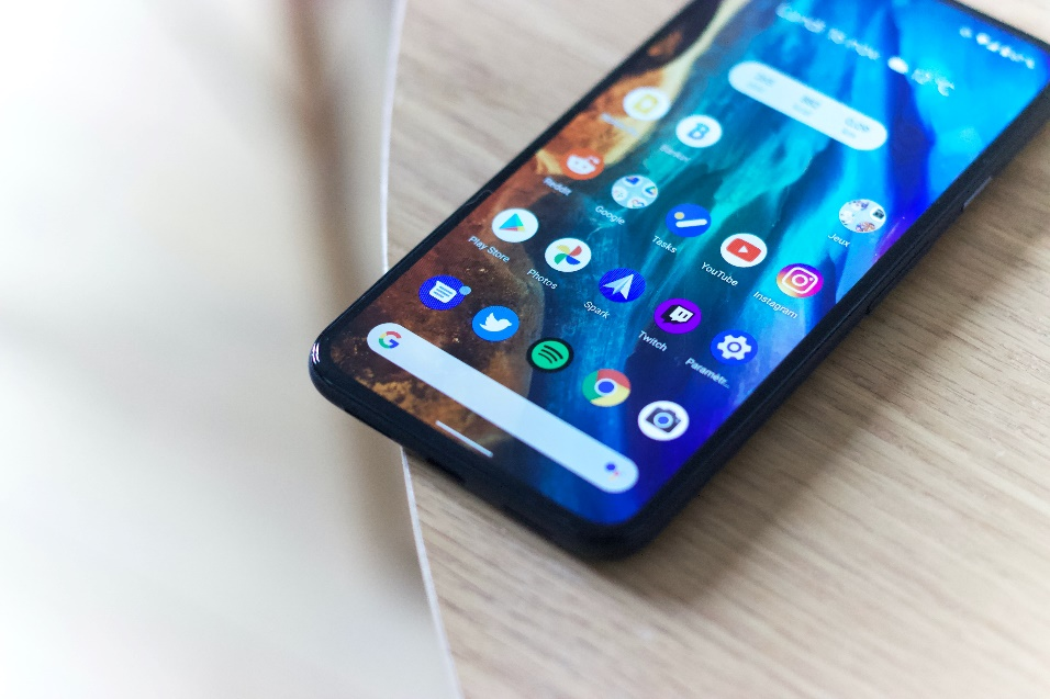
Android is a huge market and you’re missing out on a lot of potential customers if you don’t have an application for it. If inspiration for great UI/UX is what you seek, then set your attention to these 10 applications that boast great features:
While being one of the biggest platforms in the world for music and podcasts, Spotify got a bad rep from the public for its dismal UI. Clunky, unintuitive, and with a lot of potential for improvement, many of its problems were fairly substantial, leading many people to switch teams to try out other options. All of this changed after the 2021 update for the streaming giant, and they’ve made numerous changes under the hood to claim goodwill from their userbase again.
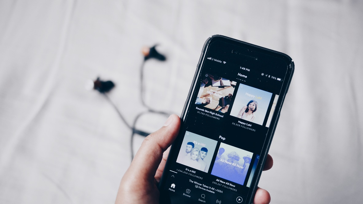
The Music and Podcasts sections have been broken down into separate tabs, with more tabs created to help people easily find the options that they’re interested in. Breaking down the UI into these sections reduces the time it takes to get from point A to B. Spotify has added many new features based on user requests to make the user experience a lot more appealing in general. The company has identified some of its strengths and what brought in a crowd, and they’ve optimized those options to make them more accessible , with their refined playlist options being the common example.
At first glance, many would confuse Bleacher Report’s application for a social media platform. BR has done a great job of designing its news application similar to a social media app, where many of the posts are aligned like cards that you’d see on Twitter or Instagram. It’s extremely intuitive and getting things done on the app is fairly quick and easy. People will find themselves scrolling for hours with how well BR’s app designers have laid out the content for them.
From a UI standpoint, all of the content has been labeled, and it’s fairly easy to see an article and make out what it’s about thanks to their smart use of tags. You open up a story, and further interactions are readily available. They also have a tab for scores, which leads you to updates about the games that have taken place recently along with other games underway. All the necessary info you need is available just below the status bar at the top of the screen based on preference, which is a welcome addition for any sports application.
Dropbox is an excellent example of how less can be more. While many would call it a boring approach to things, Dropbox has gone for an overall subdued look with new, bold fonts throughout and a more subdued UI. They’ve mixed things up by adding some graphical elements from their website to keep things light, while still keeping a professional look for most of their functions.
They’ve used the standard Android button for actions on the bottom right, which opens up a list where you can find most of the operations that you’d use Dropbox for. There’s enough iconography here to reduce the need to read each instruction as well.
Generally, there’s no need for excessive navigation around the application which is always welcome for a professional solution such as cloud storage. Applications like Dropbox don’t necessarily need an aesthetic that pleases everyone, but a manageable layout that’s easy to go through without a steep learning curve. Dropbox gets full marks for focusing on the necessary UX elements that make visual processing easy.
One of the major pitfalls that many applications run into is poorly translating the web design into something for smartphones and tablets. Designers either forget about mobile-friendliness or don’t have the technical skill to bring a larger design into a smaller form factor. But that’s not the case for Airbnb. The rental search application has a lot of options, which is always trouble when you’re looking to condense information to display on a smartphone screen.
The application has split its various options into different pages, which helps a lot in removing clutter and getting to the main action right away. They’ve used large cards to list properties with images along with other necessary details that can help you make initial decisions rapidly. The navigation tab below is designed to make getting around and finding relevant pages more convenient. All of the operations have been well-thought-out for the app’s use and implemented across the UI. And lastly, the app is distinctly Airbnb’s with its use of colors, fonts, and design language.
Uber’s application has retained a similar design for several years, being an excellent example of not fixing what isn’t broken. The core design reflects Uber’s branding perfectly, with a minimalist layout. It’s not all dull and drab, as they use colors to differentiate some elements. But what’s so notable about Uber’s take on an Android application is how efficient the UX is.

Uber provides cards and options with each option that you pick, and a single page can allow you to get a lot of things done. It’s difficult to create a design that offers several options at a time and does not overwhelm the user, but Uber manages to achieve this feat. This is excellent for users that struggle with app learning curves or want to perform a particular task in a few steps, which is a consistent theme across Uber’s apps. Whether you’re calling in a ride or want to order some food, the general layout is the same, and getting any work done is a breeze.
Designers have a lot of work cut out for them when they take on extensive applications like ESPN. The website covers sports from numerous countries, and many of them are in different leagues, and so many fixtures at a single time. How do you manage to bring down all that information into a digestible form with such limited screen real estate? ESPN carefully uses user preference to focus on those events you’d be interested in, allowing you to see all the cards that are tailored to you.

There are a lot of iconographies of team logos and different navigation options that make it easy for the user to know what’s where and how to find what they’re looking for. All the information is spread across cards when you’re looking at fixtures, and generally, they do a great job of giving a bird’s eye view of the most necessary information you need. Many pages have ample tabs as well, which also eliminates the need for subpages, which is great for those that don’t want to put in the extra effort of going through more steps.
Mint is essentially a budget tracker application that’s the recipient of the Editor’s Choice badge on several occasions. You can link the application with your bank account and it seamlessly allows you to track your expenses. Where it shines is how brilliant the UI is. Many of your expenses are split into tabs, with many of those tabs also having subsections. The data is visualized through bars, which are of different colors depending on how far you’ve gone through your set budget for them.
It's a great way of getting an eagle-eye view of your finances, but there’s also a lot of content that gives you an in-depth idea of the numbers so that you’re always aware of how the month is going. Users can make a lot of changes using the customization option that Mint provides, which allows them to fully control how the app works for their use.
Most people will already be well acquainted with Coursera. It’s one of the top learning platforms available online, offering courses on various fields and topics to educate the masses. After developing a solid foundation with their web design, Coursera quickly transitioned towards having an equally viable mobile solution. The app does an excellent job taking the same concepts and converting them into a mobile-friendly platform that’s easy to use.
The layout hasn’t changed much over the years, and they’ve used cards with modern Android guidelines to make it easy to list a great deal of information on a single page. Navigation is a breeze through the consistent navigation banner on the bottom of the screen, making it easy to get around the app’s UI. You also have a simple search option if you’re looking for specific options. Coursera’s app doesn’t reinvent the wheel but takes a great minimalist approach with a great deal of iconography and easy navigation elements to keep their design simple and intuitive.
Among many of the design-focused applications out there, Canva has been one of the go-to options in a market where many of the larger corporations failed to capture the same level of popularity. Canva just offers a lot more and has fully embraced its community, allowing them to benefit from the platform and it’s more than just a design tool. Getting acquainted with the app is easy.
You have the navigation bar to guide you if you want to head to a different page and most pages use lots of cards and tabs that you can scroll either vertically or diagonally to find a host of options. Most of the design elements are also intelligently laid out through the sidebar and other buttons available as per need, which can make the learning curve of the application more accessible for the average person.
Performinh tasks is convenient through the app as they require minimal input, and Canva has made many of the most used services on the app more prominent for the users, which is a step in the right direction and something more apps should adopt.
Todoist, as the name suggests, is a productivity application that helps people get their lives in order and achieve more. What makes Todoist worth talking about is how they’ve incorporated a simple design that’s geared to reduce the number of steps you need to take to get a lot of work done. They’ve carefully integrated many of the options that would work together into a single step, which reflects the uber-productive mantra that the application strives for.
Generally, the UI is fairly simple but all of the attention is on action rather than noise. One noteworthy aspect is how the instructions across the UI make it accessible, giving the user information about all the content available across the application. It’s an easy pick for anyone looking to get more control over their life as well as someone interested in an excellent rendition of a productivity app that ticks many of the boxes for UI/UX design excellence. Many tasks on the app are integrated in one single card at a time, which gives a lot of authority to the user without overwhelming them with the sheer number of options.
Work with a team that’s focused on creating cutting-edge solutions and strong UI/UX from the ground up with Softwareistic. We’re an Android and iOS app development agency, having resources for Flutter App Development, as well as React Native App Development services. Whether you’re looking to take your existing solution to the next level or develop something from scratch, our services are more than capable for the job.
We’ve worked with companies from all walks of life on projects across different industries of varying sizes, allowing us full competence to help bring your vision to reality.
Send us your details. We are here to answer your questions.