Email Address: contact@softwareistic.com | Phone Number: (844) 970-3900
Email Address: contact@softwareistic.com | Phone Number: (844) 970-3900


Android vs. iOS has been the most significant tech rivalry since Windows vs. Mac. It’s important to note that over the years, two tech giants have tipped the hat to each other and have followed suit with their competitors to work on similar design philosophies, core apps, and solutions. By no means are iOS or Android the same, and they’re different at first glance, but they’ve both come a long way, and making the iOS vs. Android argument has become harder than ever.
One argument that doesn’t seem to go away is regarding design, especially the UI design of each operating system. Both companies emphasize them heavily, which has had a huge impact on how apps look and behave for each OS. Here’s all you need to know:
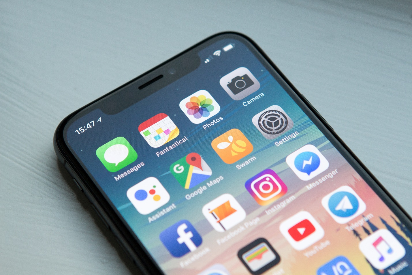
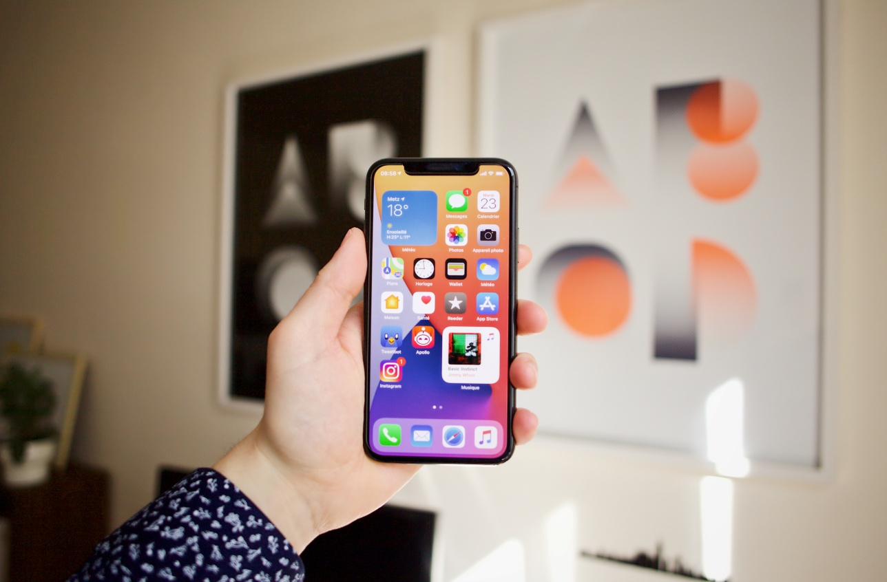
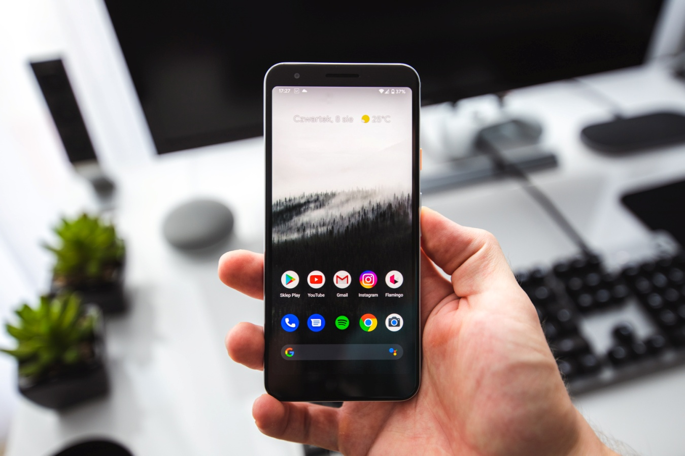
Android’s design philosophy and guidelines can clearly be understood through their Material Design, which was released around the launch of Android Lollipop and has been the go-to option for their overall design methodology. Apple doesn’t have a proper name for its Human Interface guidelines , but many have informally dubbed it the flat design.
As the name suggests, Google imagines the various components on the screen as actual material, with each having its own set of actions and material properties like shadows. Many of the content is often layered with shadows which creates a distinction and gives a separation between the materials. iOS emphasizes using accessible colors, and vibrancy to highlight the various elements on the screen to improve both navigation and the readability of the content.
Similarly, Android uses the conventional reading style from left to right and places most of the content on the left of the screen. iOS keeps it towards the center instead to make the content more apparent to the reader.
While the whole back navigation debate was a lot spicier in the past when Apple didn’t have a robust implementation for it, all has changed since both Android and iOS have added similar features for it. Generally, most Android and iOS applications have a “←” icon on the top left which the user can use to go back to the previous screen.

This isn’t a must-have feature in newer versions of Android and iOS as they both have gestures where the user can swipe on the screen to go back. If a user has an older iPhone, they might need this aspect. From a reachability perspective, the “←” icon can be harder to use on some larger screens but both operating systems provide accessibility features where it can make it easier to reach the top of the screen.
Both iOS and Android have their implementation of search bars, which are an important inclusion in helping users find context-sensitive material across various applications. Android’s implementation is fairly simple, with a persistent search bar that’s always available just below the status bar. If you have to cancel the search process, you can tap on either the back button on your phone and use the navigation gesture for the back or the “←” icon.
Apple does things a bit differently as it has two modes, namely visible and hidden. When you’re on the top of the page, the search bar will be visible, but scrolling down will cause the search bar to disappear. You will have to swipe down from the top of the screen to pull the search bar out. If you want to cancel the search, you can select the cancel text or use the “X” in the search bar to clear the text in it.
While this does take up extra space on Android at all times, the whole process can take more time on iOS if you’re searching for multiple things across a list which might make Android’s implementation more sensible, but it’s a niche use case.
The primary call-to-action button in Android is generally placed at the bottom right of the screen. It’s often used as a floating action button, with various applications having a large circle with a plus sign or any relevant icon in the middle.
iOS applications place their primary call-to-action in the top right of the screen instead. But these aren’t strict rules, and both operating systems have had working designs across final products that contradict this practice. Generally, these are designed with user feedback and ease in mind and can be interchanged to improve reachability and user accessibility. Developers may make changes as per the overall layout of their application, and if there are any errors or usage difficulties due to the guidelines, they may choose not to conform.
Suppose that you have to select from a list of options on an application, then both iOS and Android will have fairly different approaches. iOS has been using a picker instead, were similar to picking options on a traditional jukebox. You have to pick from a list of options, with many of them disappearing until you toggle near that value. You only see some of the nearest few values.
On the flip side, Android uses dropdowns instead. The background generally gets darkened apart from the new tab that’s opened, where the user has to pick from several options. Some selection menus also have an opaque circle next to the selection that’s been picked to let the user know what the current option is.
Action Menus are context-sensitive menus that appear when you decide to make certain actions. Suppose that you’re using the messages app, and you press a button to trigger the various options related to a message. It’ll pop up a small menu that will list the various options, with one or a few of them listed in red as they might be irreversible actions or important options like delete. If you want to cancel this menu, you can select the cancel option at the bottom of the screen.
To emphasize on action menu, the background is blurred out when the menu pops up from the bottom.In Android, the menu appears is on the top right of the screen, appearing as three dotswhich lead to a dropdown popping from where you can pick from multiple options.
Various applications utilize cards, which involve buttons, comments, text, videos, or even images. Both iOS and Android use cards but Android has the more detailed version among the two. They have shadows, round corners, and a gutter. iOS’ implementation uses full-width, corner-less versions without any shadows.
Android’s implementation of alerts uses flat buttons as mentioned in the Material Design documents. Many refer to them as alerts more than alert buttons, as they use all-caps text instead of a physical button to alert the attention of a viewer toward a specific decision.
iOS uses various dividers instead, which, similar to Android, consists of text — either a sentence or a phrase in the title case. The different blocks do a great job of splitting different alerts, which are either at the end of a popup or around the center.
Typography is a bigger consideration for each UI than many might imagine. Shifting from Helvetica Neue to their homebrew San Francisco, Apple has opted for a cleaner design to accommodate smaller screens while being legible on all devices. Android’s loyalty to the Roboto typeface has stood the test of time, and the operating system uses various forms of it across the UI as per need and emphasis.
Apart from the default way of using text, how they differ in the various texts is fairly different across their respective UIs. For example, Android utilizes white space, increasing it between materials to give more emphasis. iOS uses variations of the San Francisco typeset to visibly give a more distinct layout to the overall hierarchy.
The iconography on both operating systems is similar for the most part, but the main difference is the shape. iOS uses a square design for its icons, while Android uses a circular look for most of its applications. Google itself has broken this rule with some icons, and most third-party app developers tend to break it too, but it’s strictly followed in Android.
In reality, both user designs have some advantages and their respective cons. One aspect that many app developers believe is that for a certain kind of application, the guidelines or trends for a certain operating system may not be as preferable as that of the other. Similarly, depending on the kind of device you’re using, some elements may not make as much sense.
For example, the hidden search bar feature might be great if you have a smaller phone and want to see the most amount of data. But if you’re looking for various items, the extra input of having to pull down the search bar is a tedious task that you’d be better off without. Nevertheless, many developers agree that each design has something great to teach us, and they’re using tidbits from both Material Design and Apple’s guidelines to create cohesive but easy-to-use designs for the long-term.
The simple answer is yes. While Google can be a tad laxer in accepting the various submissions they get for app publications; Apple is not. Many developers will tell you the story of how they had to make several iterations to their designs, ranging from fundamental app changes to the small ads that appear on the App Store screen.
The bottom line is that you need to follow them if you want to increase the probability of your app getting published once it’s ready for the public to use. Similarly, these are viable design protocols that are optimal for the experience on each operating system, so you’re better off following the rules.
One of the biggest challenges that come from following two different design philosophies is when you’re publishing for both operating systems. While all of the core operations for each application will be entirely identical, the main difference will be how each OS’ design guideline requires the designer to implement certain aspects differently.
Ultimately, both the applications have to do the job similarly, but the mode by which they’re accessed could have more steps, or they’re activated differently due to the requirements of Apple and Google, respectively.
In a nutshell, yes. Both Apple and Google have worked hard to develop their respective design philosophies, and while each gets some things right and some aspects weaker than the other, ultimately, they’re both well-thought and cohesive designs. A person that’s accustomed to the iOS application design will not have a difficult time using other iOS apps if they’re following the guideline provided by Apple.
Similarly, Google’s guidelines are also fairly consistent. Whether you’re using a Google app or any third-party app from the Play Store, the learning curve will be easier, provided the developer has done a good job of following the guidelines.
If you need a competent Android or iOS app development agency providing Flutter app development and React Native app development , you can find the services you need with Softwareistic. We help businesses from different domains build their apps from the ground up or revamp their existing functionalities. We also develop solutions for wearable devices.
With Sofwareistic, you can communicate your ambitions for your project with us, and we take care of the entire development process, whether you need an MVP or a full project.
Send us your details. We are here to answer your questions.